In the past, we’ve shared our inspiring work for Mattel Children’s Hospital UCLA. Since that project, Blik Design/Build (the custom arm of Blik) has carved quite a niche for itself in the healthcare world. We’re excited to share the design process and environmental graphics for three recent custom clients: Kaiser Permanente’s Pediatric Clinic in San Francisco, the UCLA Daltrey/Townshend Teen & Young Adult Cancer Program in Santa Monica and our second round of graphics for Mattel Children’s Hospital UCLA.
As the saying goes, laughter is the best medicine and we truly love doing work for hospitals and bringing joy to an otherwise scary environment. Making kids and teens smile and helping ease the fear associated with hospitals was our goal.

Kaiser Permanente:
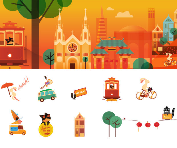
We worked directly with the pediatric team to develop a customized set of wall graphics and murals for the waiting rooms and hallways of the peds clinic. We took inspiration from the city of San Francisco and created a narrative – think of it as a guided tour – using a number of colorful characters and themed environments to escort visitors through the space and toward the waiting room. The art is meant to create a welcoming and colorful place and provide the functional purpose of wayfinding. We were happy to collaborate with illustrator Felix Wong again and create synergy between our custom world and Blik products. You might recognize Felix’s style as he’s the illustrator forBabybot x Blik wall graphics.


These creatures and characters are very impactful and they really help soften the space and enable a scary hospital to become kid-friendly. The transformation of the space was incredible. Looking at the storyboards and how this process began, we think the project almost transcends wall graphics. It’s storytelling for walls.
-Scott Flora, Blik co-founder
UCLA Daltrey/Townshend Teen & Young Adult Cancer Program:
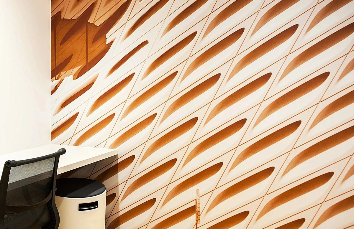
Working in tandem with the hospital staff, current and former patients, Blik developed and designed a mural for the new cancer center from Roger Daltrey and Pete Townshend of the legendary rock band The Who. Based on feedback from the teens, we designed the space in soothing blues and purples, which was determined as the best colors for patients during treatment. The design is a series of layered silhouettes that kept the location by the beach (Santa Monica) in mind. As the pictures reflect, the “chill space” is peaceful while still bringing an uplifting energy to the hospital.


Mattel Children’s Hospital UCLA: Phase 2:
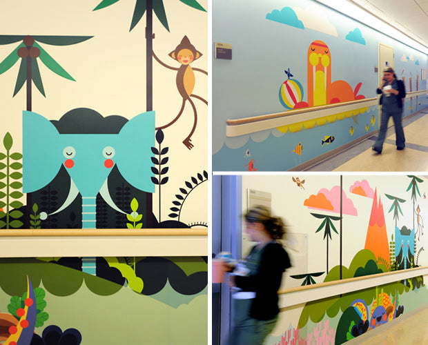
Working again with the design team at Mattel, we have continued our imaginary graphic world for the walls of the pediatric unit at the Mattel Children’s Hospital UCLA, this time bringing joy to another floor. For the second round, we went with a beach and water theme based in part by the nurses’ thoughts on the space, as well as the kids. We like the challenge of designing not just for patients, but for the hospital staff as well. Just try not to smile as you look at the photos.


Congrats to Blik Design/Build. This was an impressive undertaking and the results are beautiful. Think you would like custom graphics in your office? Connect with our teamand let us see what we can do for you.

